Blog Post

The Artist’s Process Exhibition

Show Description:
Embark on a creative journey with artists Miriam Baranov, Anita Dawson, Steven Elbert, and Hiroshi Hayakawa. Through diverse mediums and techniques, they unite in a unique exhibit, showcasing the transformative power of the artistic process.

Show Dates: June 9th- 11th
Location: Concourse Gallery,
3600 Tremont Rd, Columbus, OH 43221

About Me

Hey there! I’m a representational artist proudly rooted in the vibrant Franklinton arts district, where I call my studio home sweet home. From crafting commissioned portraits (people, pets) and murals to sharing the joy of art through teaching in my cozy studio, I’m living the creative dream!

Miriam Baranov’s Process Snippets.

Hello and welcome creatives to my blog where I share with you a behind the scenes. This is just a tip of an iceberg as sharing an entire process I would be writing a book. Nonetheless I will share a few tricks I believe could be applicable to you as an artist. Feel free to share your tips and tricks in the comment section and or ask any question. This blog will be evolving and I will be adding more content to it based on demand. Cheers!

Process Illustration

To illustrate my process effectively, I’ll use the painting ‘Rochelle’ as a reference. The photo above shows Rochelle and outlines the steps I follow to complete it. I’ll delve deeper into some of these steps, and feel free to ask questions in the comment section of my blog about this project.

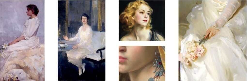
  • Finding Inspiration:
    • Client vision
    • Pinterest exploration
    • Museum visits
    • Daily life observations
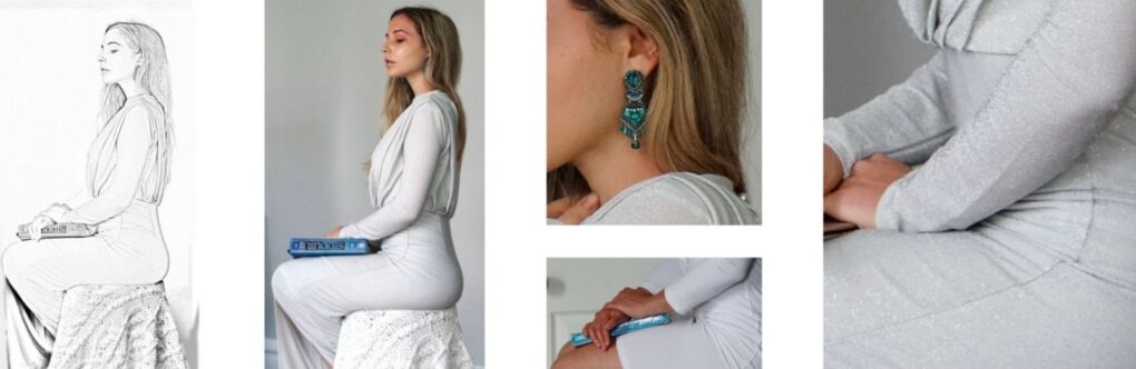
  • Getting the Reference:
    • Planning attire and setting
    • Creating a comfortable environment
    • Capturing subjects (from life or photography)
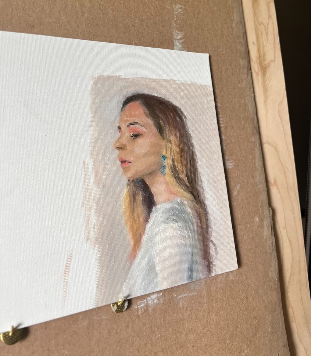
    • Proof of Concept (POC)
  • Studies
  • Transfer
  • Underpainting
  • Creating Harmony
  • Final Touches
  • Sealing for Longevity
  • Sharing and Feedback
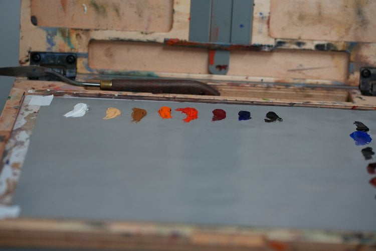
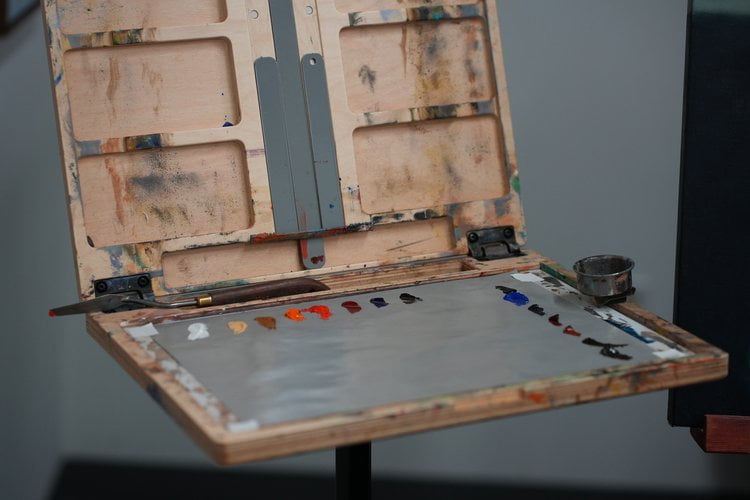
Finding Inspiration

To illustrate my process effectively, I’ll use the painting ‘Rochelle’ as a reference. The photo above shows Rochelle and outlines the steps I follow to complete it. I’ll delve deeper into some of these steps, and feel free to ask questions in the comment section of my blog about this project.

My inspiration stems from the energy of the sitter, creating a visual conversation in the painting. Before a session, I research on Pinterest for ideas on capturing features and aesthetics. This includes studying how master artists depict similar characteristics, exploring pose options, and selecting pleasing color palettes. These findings serve as examples during the session, guiding pose direction and lighting setup. References brought to the photoshoot are shown above.

Getting The Reference

Ideally, prior to the photoshoot, I engage in discussions with the model about outfits and looks, sharing inspiration shots in advance for their review. To familiarize myself with the shoot location, I either physically visit the space or conduct a video call to minimize surprises on the day. The photoshoot typically lasts 1.5 hours, with 40 minutes dedicated to capturing images and the remainder to setup. If feasible, I prefer an initial sitting with the subject for a color study, ranging from 1 to 3 hours.

Post-photoshoot, I have around 500 photos, from which I composite a single image for the painting. Refer to the above images showing the multiple photos used, including one taken after the photoshoot. In this instance, I reviewed the photos at home and, finding the hand pose unsatisfactory, used my own hands in the same light setup. The initial black-and-white photo represents the final composite I digitally crafted in Procreate, ensuring anatomical coherence and a pleasing composition.

Studies

Studies play a crucial role in significant projects. Anticipating a minimum of 100 hours for this painting, I aim to enhance efficiency by preemptively addressing potential issues. These studies are quick, small in size, lasting no more than an hour each, focusing on composition and color palette design. The chosen study, presented above, guided my decision on the color scheme for this painting.

Once I finalize the composition and color scheme, I gather all the necessary tools and materials. The primary decisions at this stage include determining the canvas size and selecting the colors.

Refer to the color palette and surface details below:

Color Palette

I’ve used a touch of Viridian Green, Lead White.

  • Titanium White
  • Naples Yellow
  • Yellow Ochre
  • Cadmium Orange
  • Cadmium Red
  • Cadmium Red Deep
  • Ultramarine Blue
  • Ivory Black

Additional Information

  • Surface: Double Oil Primed Fine Texture Belgian Linen
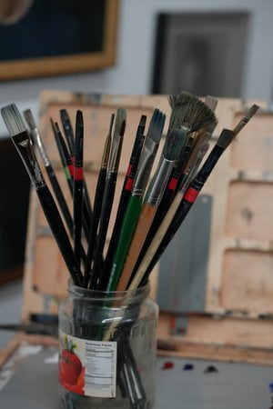
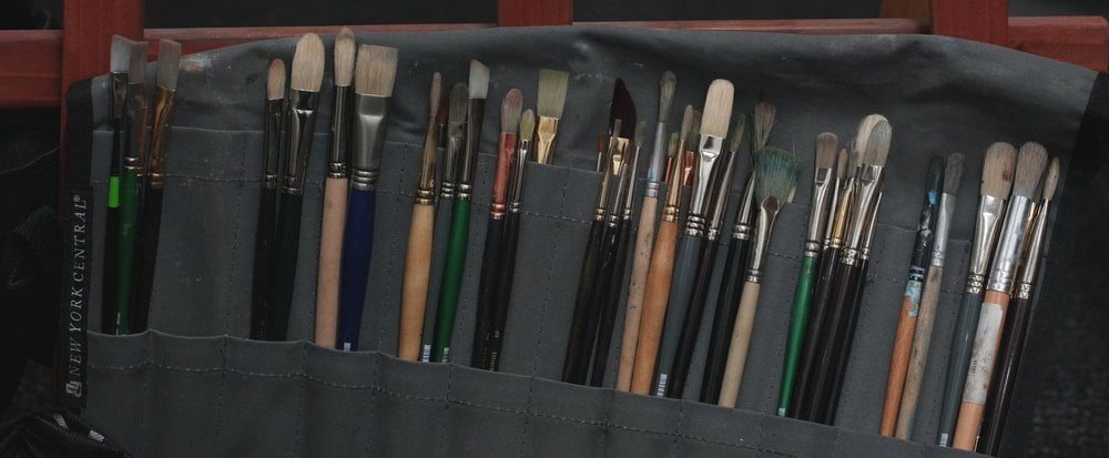
  • Brushes: I have a diverse range, including hog brushes and soft synthetics in various shapes and sizes.
Scroll to Top